
Branding Archetypes in Skincare and Wellness
In the crowded beauty market, it often feels like every skincare brand has a completely unique look. Yet a savvy observer once noted that most successful skincare branding boils down to three classic approaches. Brands either look scientific, look historical, or look homemade – or some hybrid of these. This insight has stayed relevant over the years, including in our own projects at RANCH. Below we break down these three branding archetypes, with examples and our take on why they work (and how they can overlap).
1. The Scientific Look: Clean, Clinical, Credible
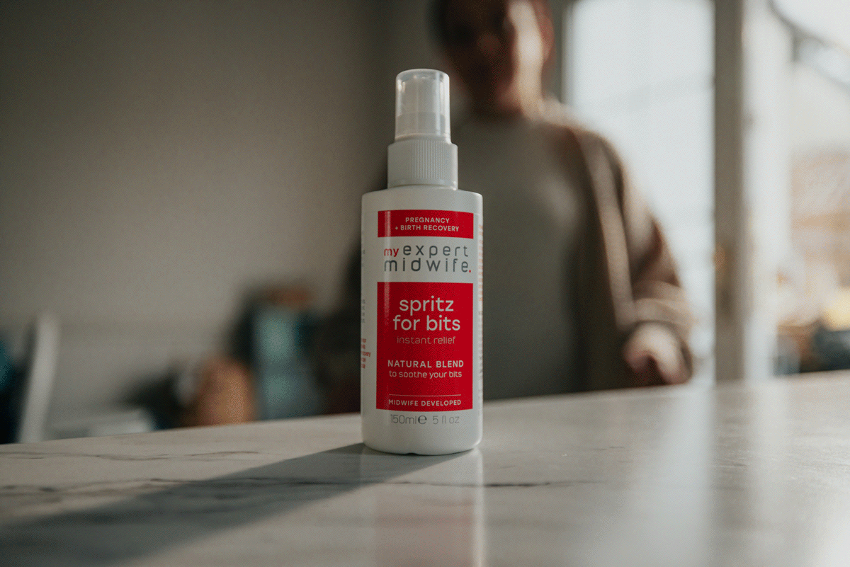
Brands that choose the scientific route present themselves like a lab or pharmacy product. The packaging and design emphasise modern, clinical minimalism – lots of white space, clean lines, and straightforward text. This style conveys a message of efficacy and trust, implying that the product is backed by science, tested by dermatologists, or formulated by experts. In fact, a “clinical” white-dominated look has been a dominating trend in skincare packaging in recent years beautypackaging.com, precisely because it signals purity and medical credibility.
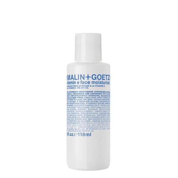
Common traits of science-led brands include: Simple sans-serif typography (sometimes even resembling prescription labels), ingredient lists or percentages on the front, and branding that highlights chemistry or technology. For example, (MALIN+GOETZ) is a skincare line that pioneered this approach – its founders wanted a modern, unisex brand referencing apothecary visuals but executed in a clean, efficient, contemporary way 2x4.org. Each product has a colour-coded text block on a white bottle, almost like a lab sample, and together on a shelf, they form a rainbow-like “colour field” of minimalist design 2x4.org. Another popular example is The Ordinary, which features stark clinical dropper bottles and names like “Niacinamide 10% + Zinc 1%” to stress its scientific formulation. Brands like these make consumers feel they’re getting a no-nonsense, effective product grounded in research.
Why it works: Many skincare consumers are comforted by a science-backed image. The visuals of a scientific brand suggest professionalism and safety – think of the trust one places in a pharmacy or a doctor’s product. When packaging looks like it belongs in a lab, customers infer that the formula inside might be cutting-edge or thoroughly tested. This approach particularly appeals to those who read ingredient labels, follow derm influencers, or seek evidence-based beauty routines. It’s no surprise that even newer “clean beauty” brands often adopt a clinical aesthetic to emphasise transparency and “nothing to hide” in their ingredients.
However, the all-white laboratory look is evolving. While it established credibility, some find it cold or indistinguishable on shelves. Lately, brands have been experimenting with softer colours or friendlier visuals without losing the scientific vibe, beautypackaging.com. The key is maintaining that sense of clarity and expertise. Whether purely minimalist (like a medicine bottle) or a pastel-hued twist on clinical, the scientific branding pillar remains a powerful way to say “Trust us – we know what we’re doing.”
2. The Heritage or “Old Remedy” Look: History, Mystery, and Tradition
This second approach goes in the opposite direction – back in time instead of forward. These brands build their identity around heritage, tradition, or even ancient mystique. The packaging might look old-fashioned, ornate, or purposely homespun, as if based on a century-old recipe or a secret discovered in grandma’s attic (or an Egyptian tomb!). The goal is to invoke a sense of timeless wisdom: if a remedy has been around for generations, surely it must work, right?
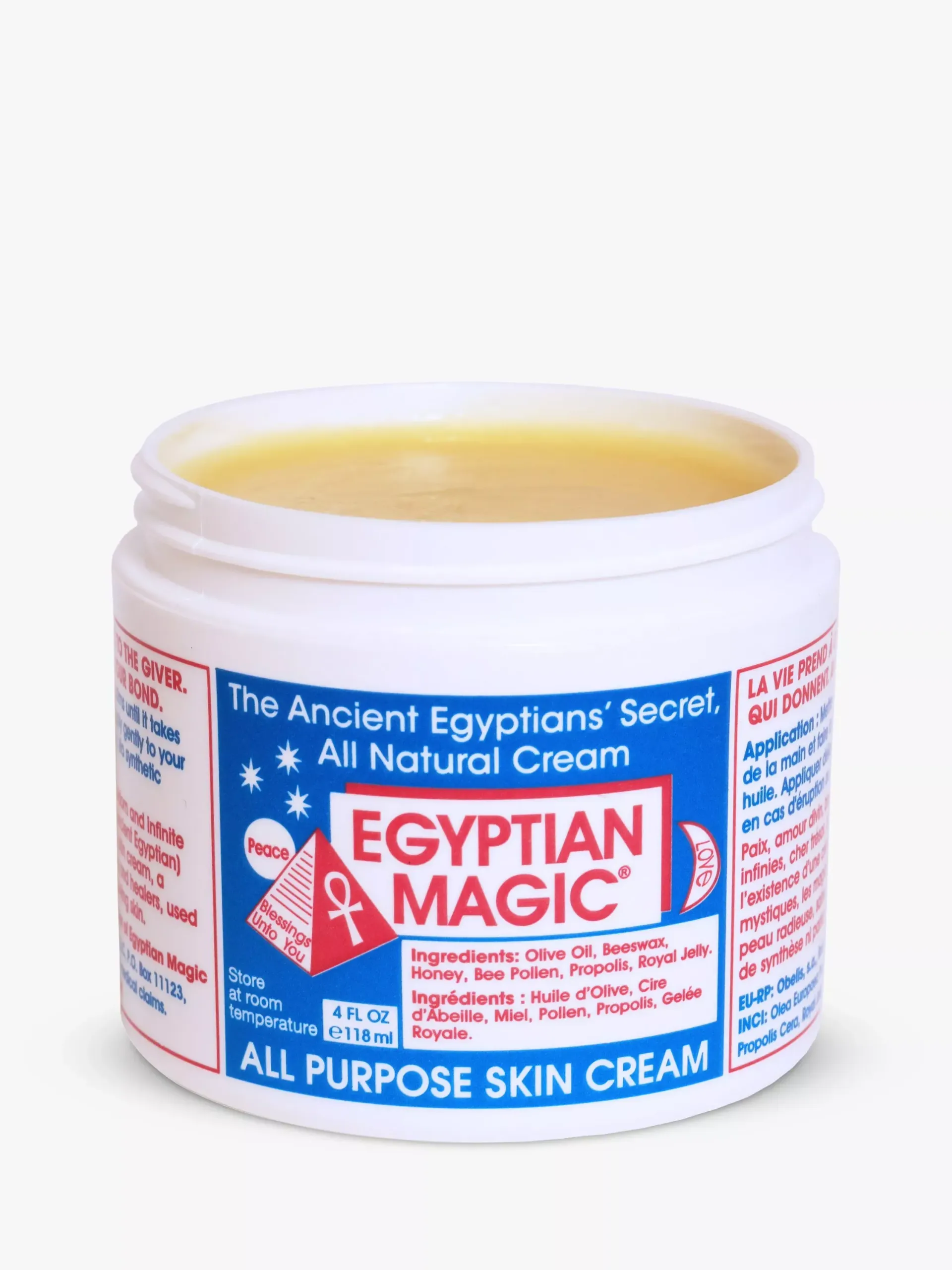
A great example here is Egyptian Magic, a cult-favourite all-purpose skin balm. Everything about its story and packaging leans into the “ancient secret” narrative. The founder famously claimed he learned the formula from a mysterious doctor who said it was used in ancient Egyptian tombs, and even adopted the moniker “Lord Pharaoh ImHotepAmonRa” to fit the legend amazingy.com. The jar’s label design is admittedly quirky – bold red and blue text with an old-school look – but that almost unsophisticated appearance reinforces the idea of a time-tested folk remedy. There’s a feeling that this product isn’t a slick new concoction, but rather a tried-and-true salve handed down through ages. (Indeed, Egyptian Magic’s success grew largely through word-of-mouth rather than glossy marketing amazingy.com, staying true to its old-school vibe.)
“Heritage” branding can take many forms. Some brands emphasise their founding year and origin – for instance, Kiehl’s proudly prints “Since 1851” and maintains an apothecary aesthetic echoing its 19th-century pharmacy roots sarahanncampbelldesign.wordpress.com. Others use vintage-style packaging: ornate fonts, crest logos, or illustrations that evoke a bygone era of remedies and potions. Even if the brand itself isn’t actually very old, it might craft a pseudo-historical backstory or design. The idea is to tap into consumers’ nostalgia and belief that older = wiser. A product that “looks old” conveys that it’s stood the test of time or is based on age-old knowledge. This can be incredibly reassuring, especially for natural and wellness-focused products where “ancient wisdom” (like Ayurveda, traditional Chinese medicine, etc.) is a selling point.
Why it works: Storytelling is at the heart of this approach. Humans love a good origin story, and a historical angle gives a product depth and authenticity. A beautiful vintage jar or a reference to an ancient civilization ignites curiosity and romanticism – it’s more emotional than the clinical approach. Consumers who value tradition, who are wary of trendy chemicals, or who just appreciate a classic, elegant shelf appearance gravitate towards these brands. The heritage look whispers that the product connects to something bigger: cultural tradition or historical practice. And in an era of rapid innovation, stability and nostalgia have their own appeal.
Of course, authenticity is key. If a brand takes this route, it must back it up – either by actual history or at least by sincerely embracing the values of tradition (e.g. simplicity, natural ingredients, artisanship). When done right, the heritage approach can make a new brand instantly feel established and trustworthy.
This is paragraph text. Click it or hit the Manage Text button to change the font, color, size, format, and more. To set up site-wide paragraph and title styles, go to Site Theme.
3. The Homemade (Artisanal) Look: Personal, Crafty, and Accessible
The third classic branding approach is to make your product look like it was whipped up in someone’s kitchen rather than a corporate lab. This is the “homemade” or artisanal vibe, and it trades on personal connection and authenticity. Packaging here might be simple and comforting – think hand-drawn logos, mason jars or tins, and labels that resemble they were printed at the local shop down the street. The brand voice often highlights small-batch production, family recipes, or humble origins (sometimes literally mentioning a kitchen table genesis).
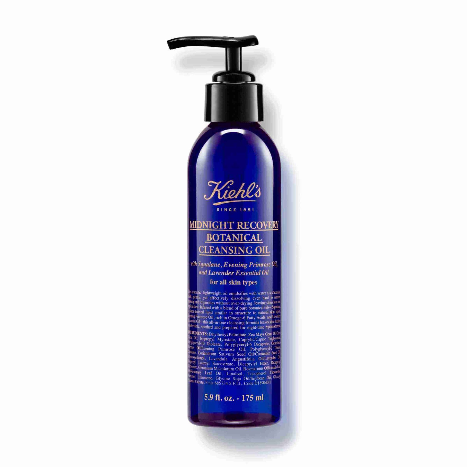
Consumers are drawn to homemade-looking brands because they feel genuine and approachable. In an age of mass production, something that looks handcrafted stands out as sincere. A great example is Kiehl’s, which, despite now being a global brand, hasn’t forgotten its small apothecary beginnings. Kiehl’s started as an old-world herbal pharmacy in 1851 and initially compounded products by hand sarahanncampbelldesign.wordpress.com. To this day, Kiehl’s packaging is relatively plain, filled with text and basic fonts, almost like a product decanted and labeled in the store. That lack of flash is intentional – it says the product speaks for itself and is made by experts who care more about the formula than fancy design. It feels a bit “homemade,” or at least home apothecary, which aligns with the brand’s identity of genuine, honoured quality.
Modern indie skincare brands also thrive on the homemade aesthetic. Lush Cosmetics is a notable case: they literally put the face and name of the person who mixed each batch on the product sticker! In Lush’s factories (which they call kitchens), products are made by hand with a personal touch, and the company proudly displays the compounders’ faces on packaging to show each item was crafted by a real person weare.lush.com. This level of transparency and humanisation turns a simple jar of cream into a personal gift from a maker. Likewise, countless artisanal soap and skincare brands on platforms like Etsy use hand-lettered labels, recyclable brown paper wraps, and other homespun details to scream “we’re a small business with a heart.”
Why it works: The homemade/artisanal look builds trust through intimacy and values. Consumers who are wary of big corporations or harsh chemicals may prefer a brand that looks like it’s made by a friendly neighbourhood soap-maker or a wise grandmother figure. The aesthetics often imply natural ingredients (earthy colours, images of botanicals), ethical production (recycled materials, simple packaging), and a labor of love. This approach fosters loyalty because buyers feel they’re supporting real people and getting a product made with care, not just another item off an assembly line. It aligns with the broader movement of authenticity in branding – being honest, transparent, and human.
However, as with the other archetypes, execution must match reality. If a brand presents itself as handmade or indie, but is mass-produced with synthetic ingredients, consumers will feel misled. When genuine, the artisanal brand look can command premium prices and passionate fanbases, because it offers not just a product but a story and a connection.
Blurring the Lines: Hybrid Branding in Today’s Market
It’s important to note that these three branding archetypes aren’t mutually exclusive silos. Many of today’s most interesting skincare brands blend elements from all three to create a unique identity. The initial observation that sparked this discussion even noted that modern brands often sit “across these 3 points of a spectrum” rather than at one extreme.
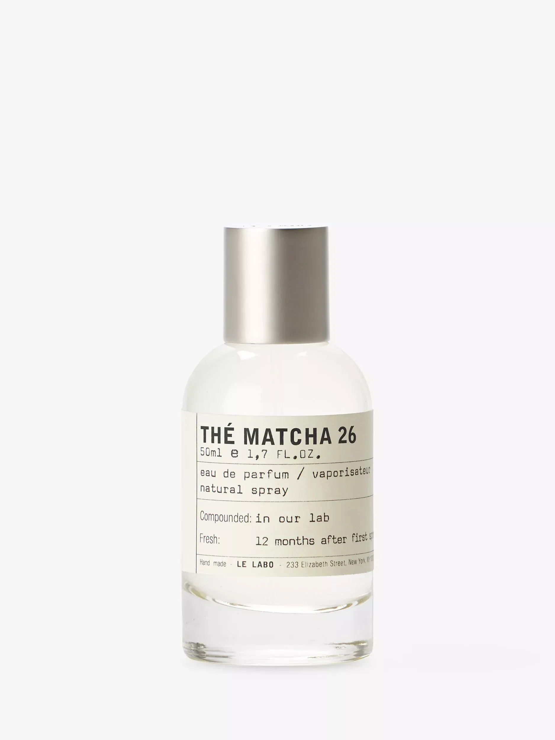
Case in point: An example of a hybrid might be a brand that uses vintage apothecary packaging with a modern twist – say, an amber glass bottle with minimalist typography. This combines the heritage vibe (glass and old apothecary cues) with the scientific/minimalist vibe (clean font, no ornate designs). We see this in brands like Aesop or Le Labo, which feel both retro and modern, giving a sense of old-world craftsmanship married to contemporary design sensibilities mintoiro.commintoiro.com. Even mainstream brands are doing it: some “clinical” brands now add a dash of soft colour or botanical imagery to appear more human, and traditionally “homemade” brands might highlight lab results to boost credibility. The trend forecast for design in 2025 notes a “Time Warp” aesthetic, where creators remix past and present styles for fresh interpretations beautypackaging.com – essentially a deliberate blend of old and new to surprise and reassure the consumer at once.
Why blend approaches? Because consumers today are diverse in what they trust and desire. Mixing elements lets a brand tell a richer story. For instance, a product can look high-tech and environmentally conscious, or historically rooted and scientifically advanced. A hybrid approach can broaden your appeal – you might catch the eye of the ingredient-savvy sceptic and the sentimental traditionalist in one fell swoop. The key is to blend coherently: your brand can straddle styles as long as the overall narrative makes sense and feels authentic.
For skincare entrepreneurs and marketers, the takeaway is that these three branding pillars – Scientific, Heritage, Homemade – are like primary colours. You can stick to one pure hue or mix them to paint your brand’s identity. When crafting or reinventing a brand, ask yourself some key questions:
- What do my target customers value most? If they crave proof and results, a scientific lean might resonate. If they cherish tradition or natural simplicity, a heritage or artisanal feel could win them. Knowing your audience guides which “story” they’ll connect with.
- What is the truth of my product and founding story? Authenticity is paramount. If your formula came from cutting-edge lab research, it makes sense to look clinical. If it’s based on your grandmother’s recipe or a cultural ritual, lean into that heritage. And if you literally started mixing batches at home, don’t be afraid to embrace a homemade charm. Align your branding narrative with your actual brand values and origins for credibility.
- How can I stand out in my category? Look at competitors: are they all doing sleek science looks? Maybe an old-fashioned apothecary style will differentiate you. Is everyone going earthy and handmade? Perhaps a crisp, medical aesthetic will pop out on the shelf. The three approaches give you a strategic toolset to zig where others zag, while still using a language customers understand (since these archetypes are familiar to people).
- Can I combine elements for a unique twist? You don’t have to be boxed in. As we discussed, hybrids often feel modern and innovative. Just ensure the combination is deliberate and reflects a consistent brand voice. For example, you might use clinical packaging but with a retro logo and a humanising tagline – if done thoughtfully, this can convey both authority and warmth.
In the end, effective branding in skincare is about building trust and connection. Whether you do that with a lab coat aesthetic, a nostalgic story, a handmade touch, or a blend of all three, the goal is the same: to make consumers believe in your product and feel good about choosing it. The three pillars of branding are enduring because they tap into basic human responses – our trust in science, our love of stories, and our yearning for personal touch. They worked decades ago, they work today, and as trends evolve, we’ll likely see new creative riffs on these themes.
By recognising these patterns, brands can more consciously craft their image. And for consumers, it’s a fun exercise to spot which strategy a product is using on you (is that serum trying to look like it came from NASA, or from Cleopatra’s vanity, or from a farmer’s market?). In our experience at RANCH, being mindful of these archetypes – and knowing when to stick to them or mix them up – has been invaluable in developing compelling brand identities.